What's new ·
Lighter, more consistent look across the entire logged-in area
Compact typography, neutral borders, buttons and fields sharing the same standard, and support in floating cards that never squeeze the conversation.
By Lucas Marchon, Founder at BrainChat
The logged-in area grew feature by feature, and each screen ended up with slightly different sizes, borders, and buttons. This update brings everything under a single standard and changes how the support workspace uses screen space.
What changed in the visual design
- Unified, compact typography, matching the same density as the sidebar.
- White background and neutral borders. Blue now appears only on hover, focus, or selection.
- Buttons, search bars, selectors, and tabs sharing the same shape and height across all screens.
- Focus outlines that are no longer clipped at the edges of fields.
Support in floating cards
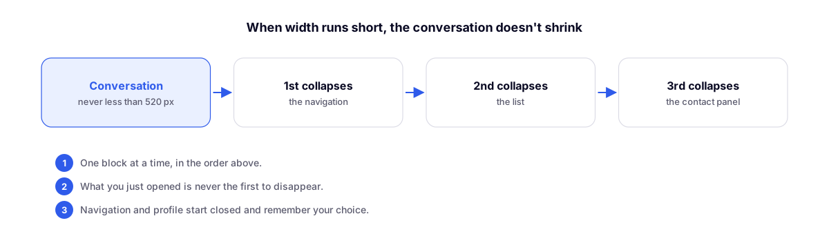
Conversations, Email, Wiki, and My Space are now blocks rendered as cards over a flat background. When space is narrow, the conversation never drops below 520 px: the other blocks collapse one by one—first navigation, then the list, and finally the contact panel. Whatever you just opened is never the first to disappear.
On mobile devices, each block takes up the entire screen.
Related updates
- Conversation Kanban: the board follows the same card standard.
- Contact and company profile on a dedicated page: the side panel has been replaced by a full page.